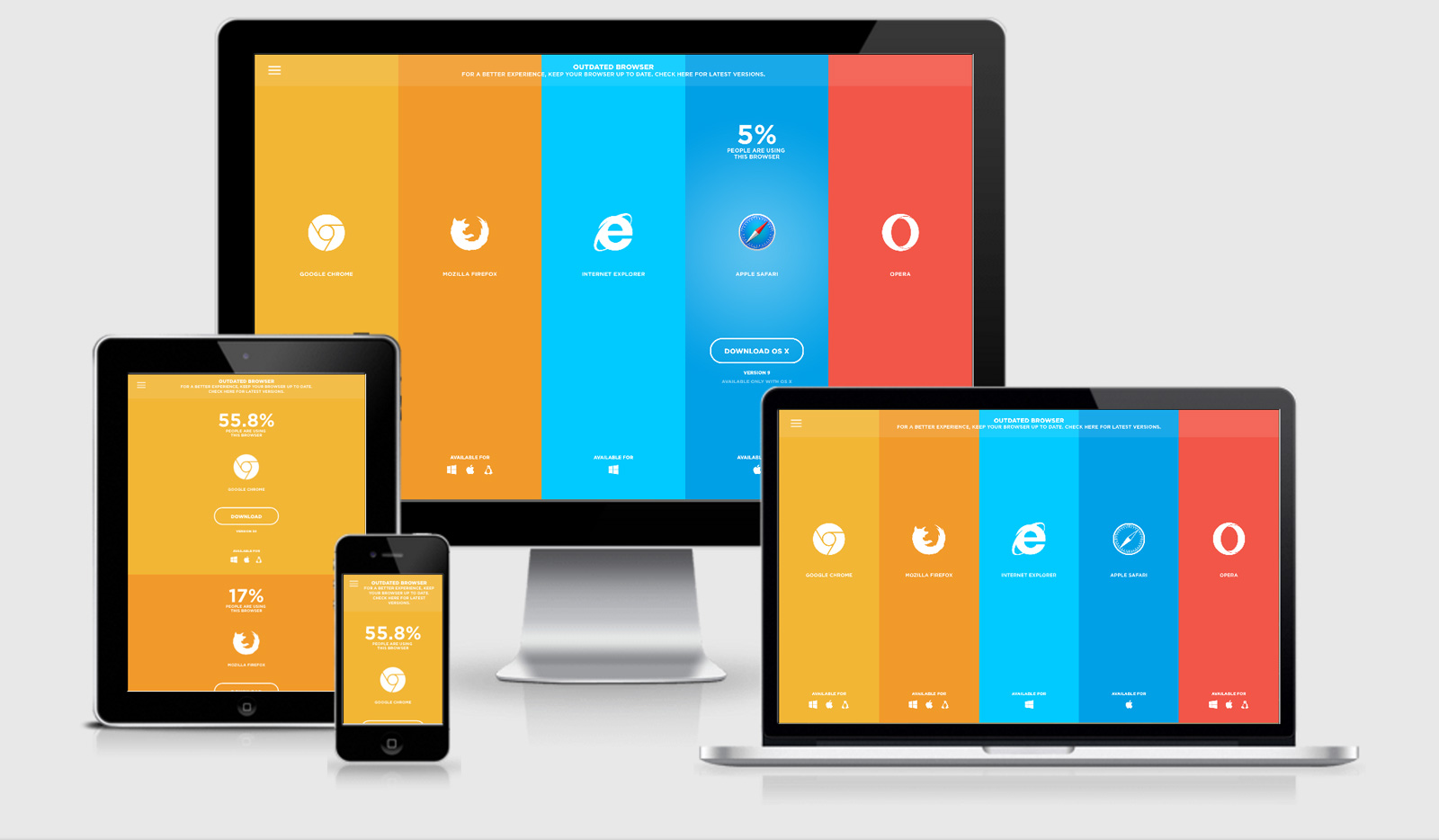
As a website is created by the developer, often they are seen to design for bigger screens, thereby losing sight as to its appearance, when the user has same site browsed from their mobile phones. As links are clicked by the users within the site through their mobile phones, navigation and reading becomes tough, requiring re-sizing and zooming for clicking or reading. It is here that the importance of device-specific site developing becomes necessary. Single fit all size : Responsive Web Design is considered to be a procedure which recommends design and website implementation to respond to environment and user behavior based upon screen size, operating system and orientation of their device. It is for those informational web pages that responsive web design is found to be quite suitable, with information present on the screen’s right side in desktop application, while in mobile applications is brought to page bottom. Responsive Web Design Benefits Responsive web design does come with few benefits like : Used across all screen sizes - Internet can be viewed on 20” monitors, 10” net books, 15” laptops, 3” smart phones, 7” tablets and every size that is found in between. The wide difference in heights and widths is also considered, if screen is portrait or landscape along with screen resolution. Enhances SEO - Page rank is improved with the site’s single version. Page ranking is impacted upon issues that arise in the site’s two versions. "Effort and maintenance cost reduces because of single link" Offers flexibility and control: At a single centralized place, changes are possible. Multiple vendors are not required to be contacted for making changes when different development firms develop your mobile application/site. Responsive Web Design is applicable in three major scenarios Blog Sites/Corporate Sites: Need of the business, generally is site first and mobile second. Rich images are less required for corporate sites, while target audience is regarded a great factor and device-agnostic solutions higher. There is no need for extensive user input and minimum images needed for blog sites. Brand consistency is held primary for such site types. With a single site working on mobile and desktop screens, keeping brand identity consistent is much easier. Also, for communicating between multiple vendors like various entities responsible for site mobile and desktop versions, style guides are not required. News/Media Sites: Users in such site types are much accustomed towards scrolling to bottom from top when using their mobile device. Here, responsive Web Design functions better. Such sites are considered to be text-heavy, while sections like breaking news do need updates of real-time content, adding to maintenance expenses, if for the design, various mobile technology options get used. Location related Services: Generally, direction and maps finder services have been considered to be image heavy. It becomes necessary to use the fingers on the screen for viewing closely the routes and for getting better clarity resizing and zooming, in such service types. Moreover, auto-adjustment is essential, something that is supported by Responsive Web Design.


